A Human-Centered Brand for a Merging Health-Care Organization
INSIGHT
Two respected and well-loved health-care organizations were merging. While both had strong reputations and deep client trust, they faced a challenge: they needed a unified identity that clearly communicated their shared values, and the enhanced, combined care experience the merger would deliver.
This merger created a fresh moment to redefine what the combined organization stood for. There was a chance to craft a brand that didn’t just merge two names, but reimagined a new identity that felt warm, approachable, supportive, and clinically excellent all
at once.
SOLUTION
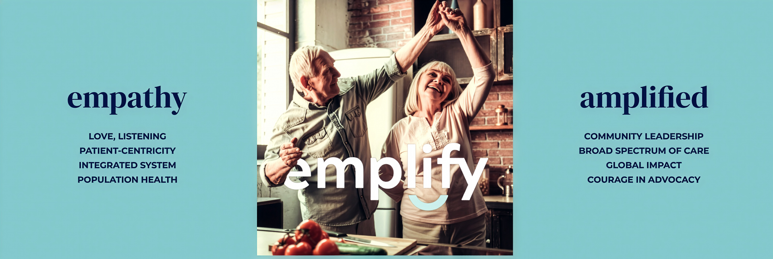
We developed a brand under the name “emplify” that visually and emotionally captured this new identity.
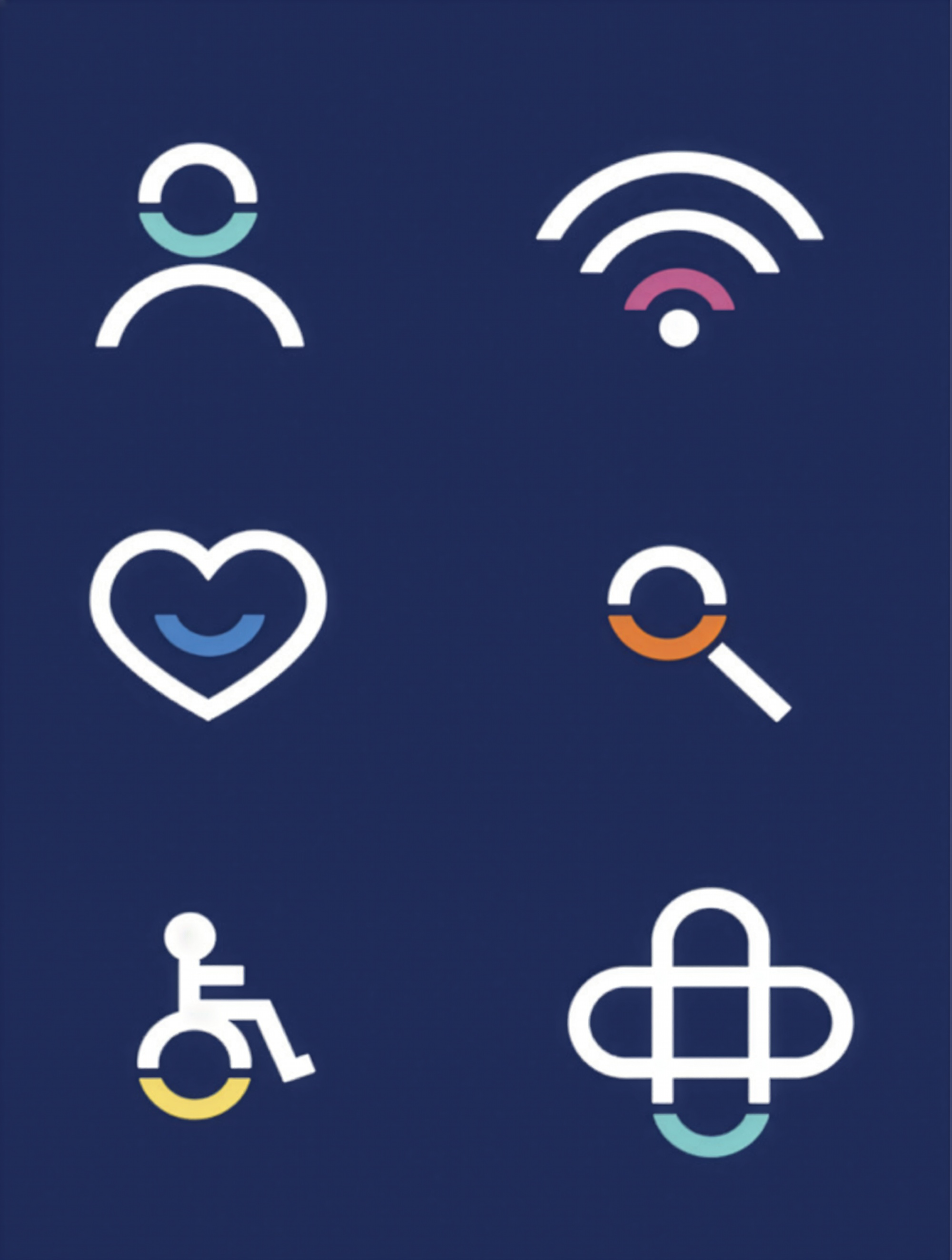
The lowercase, rounded typeface and a subtle “smile” curve connecting letters conveyed a friendly, caring,
and supportive tone. That gentle smile, nestled subtly under the “lify” emphasized joy, empathy, and uplift.
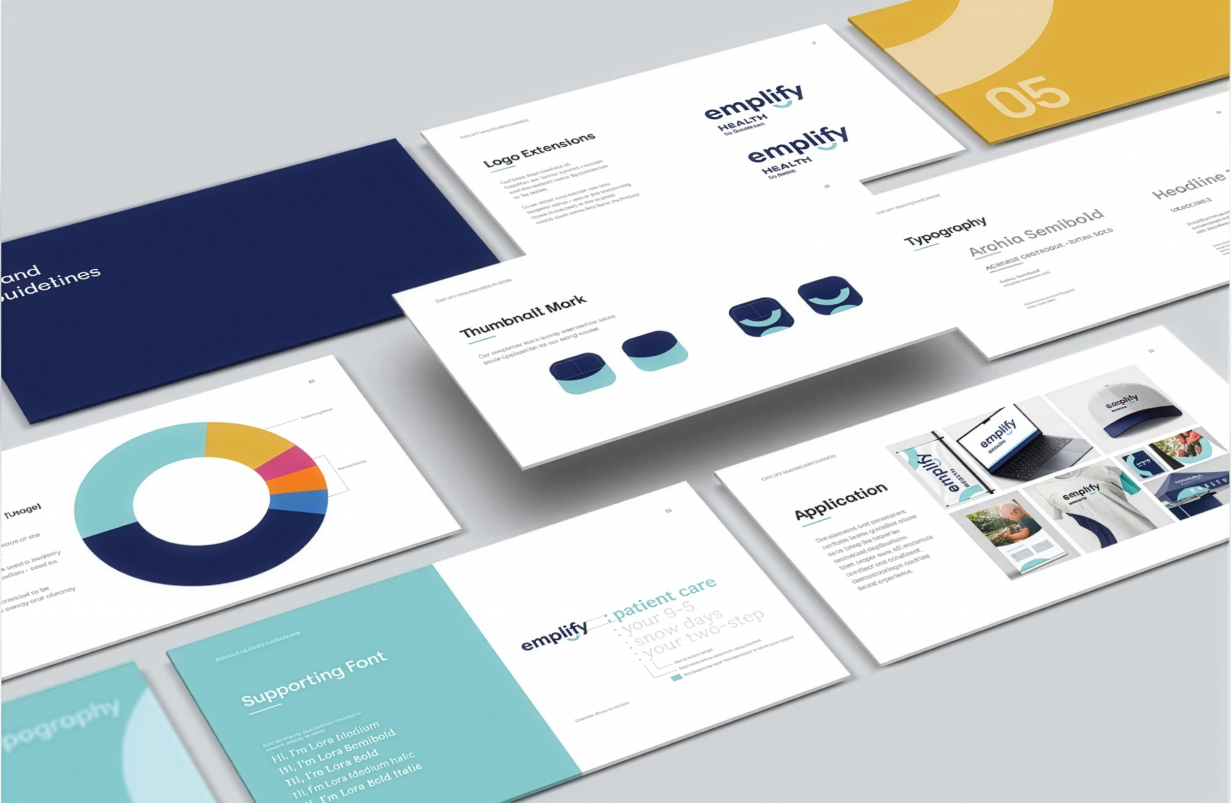
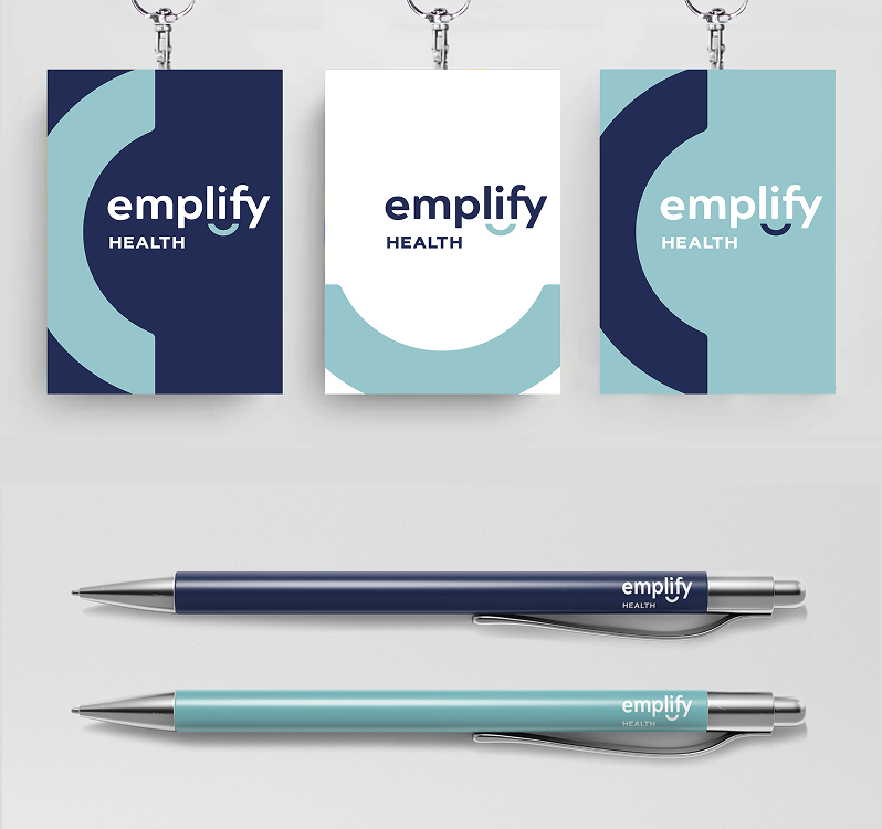
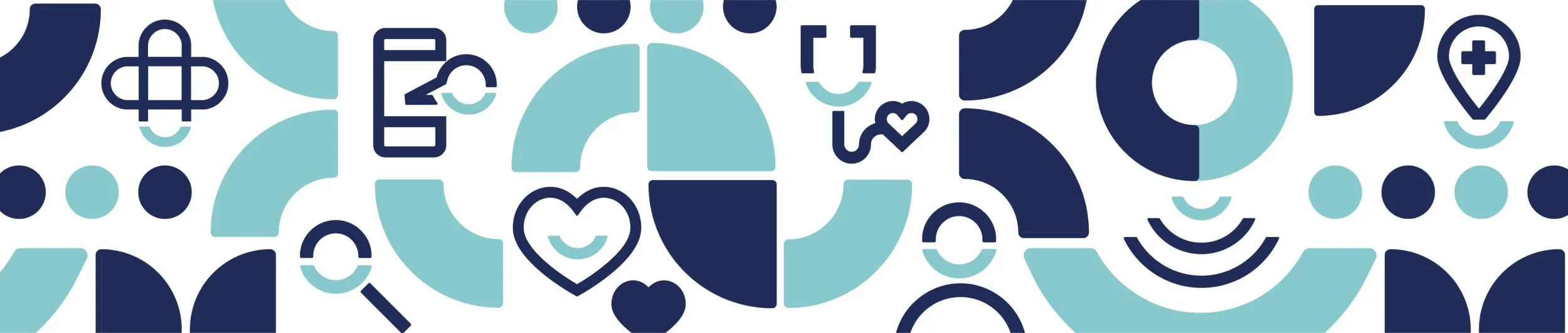
The brand was extended into a full visual ecosystem: fresh, inviting colors; honest, in-the-moment photography; custom icons and patterns derived from the brand identity; and consistent applications across stationery, social media, wall murals, banners — even
the ambulance design. The result is a seamless,
cohesive brand experience that carries through from
first impression to real-world touchpoints.
RESULTS
The new brand gave the merged organization a unified, distinctive identity that balanced warmth and professionalism. It communicated clearly to patients, staff, and the community that this was more than a merger, it was the start of something better.
The result: a brand experience that resonated emotionally, built trust, and reflected both care and excellence in every detail.
Project completed with the talented team at Finch Brands